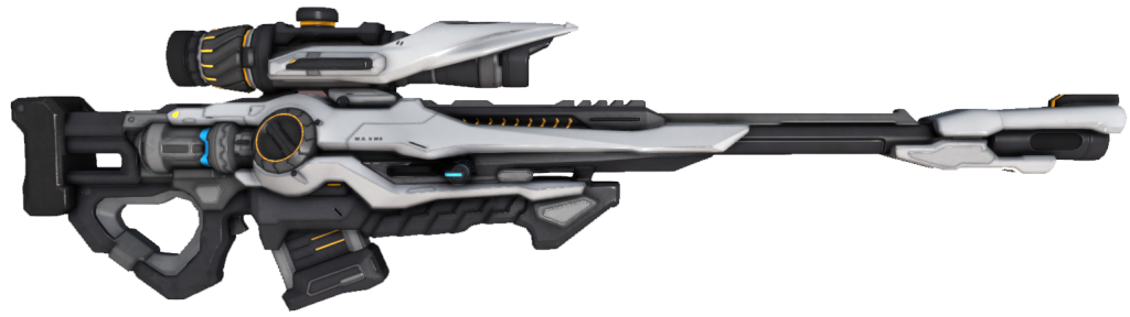
Here is my art work...
Yea I know It's terrible, It's my first ever PB2 art. I used photoshop
It can be named CS-Carabine, It's very very accurate Carabine, and it does only 3 burst shots only. Each projectile deals slightly more damage than the projectiles of CS-Assault Rifle.
My terrible art work...
19 posts
• Page 1 of 1
My terrible art work...
![]() by maxim12
by maxim12 ![]() » 2 May 2016, 22:15
» 2 May 2016, 22:15
-

maxim12
- Phoenix Falkok [450]
- Posts: 463
- Joined: 16 July 2013, 20:56
Re: My terrible art work...
![]() by tehswordninja
by tehswordninja ![]() » 2 May 2016, 22:40
» 2 May 2016, 22:40
For a first try that is pretty good honestly. Even as a gun by itself, it isn't that bad. Keeping improving and you could make some pretty neato stuff
-

tehswordninja
- Proxy [700]
- Posts: 705
- Joined: 10 November 2013, 17:24
- Location: Witty tagline
Re: My terrible art work...
![]() by maxim12
by maxim12 ![]() » 2 May 2016, 22:43
» 2 May 2016, 22:43
tehswordninja wrote:For a first try that is pretty good honestly. Even as a gun by itself, it isn't that bad. Keeping improving and you could make some pretty neato stuff
Thanks I guess, I hope I will improve, It took me 1 or 2 hours to make it.
-
maxim12
- Phoenix Falkok [450]
- Posts: 463
- Joined: 16 July 2013, 20:56
Re: My terrible art work...
![]() by Wardemption
by Wardemption ![]() » 3 May 2016, 02:56
» 3 May 2016, 02:56
Looks good for an another game: Mass Mayhem 2.
I forgot the name tbh, not sure of it.
I forgot the name tbh, not sure of it.
-

Wardemption
- Falkok [250]
- Posts: 286
- Joined: 19 December 2014, 02:50
- Location: PKR, NP
Re: My terrible art work...
![]() by David91523
by David91523 ![]() » 3 May 2016, 11:36
» 3 May 2016, 11:36
heh.
Little bit terrible.
it looks like made MS paint.
Try use GIMP and Paint tool SAI
Little bit terrible.
it looks like made MS paint.
Try use GIMP and Paint tool SAI
-

David91523
- Cyber Grub [25]
- Posts: 37
- Joined: 19 July 2013, 16:35
Re: My terrible art work...
![]() by maxim12
by maxim12 ![]() » 3 May 2016, 12:32
» 3 May 2016, 12:32
Sorry, but what should I add to the gun to make it PB2 or PB2.5 style?
-
maxim12
- Phoenix Falkok [450]
- Posts: 463
- Joined: 16 July 2013, 20:56
some thoughts
![]() by Roxxar
by Roxxar ![]() » 3 May 2016, 22:03
» 3 May 2016, 22:03
David91523 wrote:heh.
Little bit terrible.
it looks like made MS paint.
Try use GIMP and Paint tool SAI
Why don't you give actual advice instead of useless quips? It's not the program that's the problem, it's obviously his lack of experience in the program itself. If he uses other programs, he may as well be even more confused than before considering how all of them are vastly different from the other. Also, I don't see the problem with him using Photoshop; it's a highly-praised editing program that essentially created a verb/trend of itself, is used by MANY editors around the world, AND is one of the only editing programs with high renown; what gives you the right to undermine the program just because it looks "little bit terrible"?
(If you didn't mean as much as I thought you said, sorry. I just really wished that you would say more than just "looks bad." I guess what I'm trying to say is that I feel you should give a reason when calling something bad.)
Back on-topic to OP - it looks nice, but as some others have said, it doesn't fit PB2's general style. If you weren't aiming for that, then that's okay. The thing with PB2 is that it has generally thick lines, solid colors, and relatively simple designs. Also, a thing I want to point out are proportions - truth be told, I feel that your primary problem so far is the lack of proportions; albeit the game is fictional, the CS weapons are generally similar to our own modern ones. Look at a few real guns (obviously through Google images or something) and try to model your own gun while reminding yourself of the size. As of now, I personally think the stock is a little big and the barrel/muzzle are a little small, but that may just be me.
And as I've said previously, the PB2 style is a generally thick, simple style. Due to a lack of examples and my laziness, I'll just be using my own works to demonstrate this. Anyway, check out THIS sniper rifle from Firefall. When I was messing around with GIMP (I personally use GIMP, this doesn't mean you should, though) I created my own rendition of the rifle in PB2's style, which you can find in THIS link right here. Obviously, it looks out-of-place when compared to other guns in PB2, but the changes are extremely noticeable. First and foremost, it's lacking the little details; I see PB2 as having a simple art style, so I removed a lot of big details such as those in the foregrip, receiver, and scope. The next noticeable change is the color coordination: the outlines are basically just a darker shade of the part it's outlining. What I also believe to be a significant change is the fact that my rendition is a little more compact. In this case, the barrel and scope became a little shorter, while the receiver and stock seems to have bulked up a little bit.
Keep in mind that I'm really not trying to imply that you're bad, or I'm better with this essay I just typed out. By this point, I'm kinda just doing some [extended] rambling, but with respect, insight, and choice... those are my thoughts.
tl;dr - if u wanna draw in pb2 style, i think you should keep proportions and outlines in mind, as well as maybe a different color choice? just keep working and you will get better
-
Roxxar
- Civil Security Lite [100]
- Posts: 138
- Joined: 16 July 2013, 19:47
- Location: Trash Can
Re: My terrible art work...
![]() by The Shadow Fighter
by The Shadow Fighter ![]() » 3 May 2016, 22:09
» 3 May 2016, 22:09
Looks good for a first time. Good job maxim12
9/10
9/10
-
The Shadow Fighter
- Cyber Grub [25]
- Posts: 48
- Joined: 7 February 2016, 13:04
Re: My terrible art work...
![]() by Martin The Wolf
by Martin The Wolf ![]() » 5 May 2016, 15:25
» 5 May 2016, 15:25
David91523 wrote:heh.
Little bit terrible.
it looks like made MS paint.
Try use GIMP and Paint tool SAI
Did you even read what he said? Or are you one of those people.
Looks at title. Writes random shit without even reading what they said.
or
Looks at artwork, scroll past what he wrote.
B1tCh Y u N0!!!!
Anyway, needless to say since it has already been said before, but I am going to it anyway, Looks good for a first try.
But try and make your next gun Sci-Fi-ish.
-
Martin The Wolf
- Advanced Usurpation Soldier [150]
- Posts: 174
- Joined: 6 December 2014, 02:29
- Location: Dong/Kappa
Re: My terrible art work...
![]() by David91523
by David91523 ![]() » 6 May 2016, 09:49
» 6 May 2016, 09:49
Martin The Wolf wrote:David91523 wrote:heh.
Little bit terrible.
it looks like made MS paint.
Try use GIMP and Paint tool SAI
Did you even read what he said? Or are you one of those people.
Looks at title. Writes random shit without even reading what they said.
or
Looks at artwork, scroll past what he wrote.
B1tCh Y u N0!!!!
Anyway, needless to say since it has already been said before, but I am going to it anyway, Looks good for a first try.
But try and make your next gun Sci-Fi-ish.
Chill out maybe next time when you rage
-
David91523
- Cyber Grub [25]
- Posts: 37
- Joined: 19 July 2013, 16:35
Re: My terrible art work...
![]() by darknessinside
by darknessinside ![]() » 6 May 2016, 10:53
» 6 May 2016, 10:53
David91523 wrote:Chill out maybe next time when you rage
If you think complaint = rage, I don't know how but you left me speechless and I applaud to you.
----------------------------------------------------------------
As almost everyone said, it's pretty good for a first try.
Although, you could make the lines thicker to make it look more PB2-ish, and follow the tips some others gave you.
Hoping to see more of these, good luck with your future artworks.
Last edited by darknessinside on 6 May 2016, 17:46, edited 2 times in total.
-
darknessinside
- Recruit
- Posts: 7
- Joined: 30 April 2016, 19:32
Re: My terrible art work...
![]() by Martin The Wolf
by Martin The Wolf ![]() » 6 May 2016, 13:45
» 6 May 2016, 13:45
David91523 wrote:Chill out maybe next time when you rage
Where exactly did I rage?
-
Martin The Wolf
- Advanced Usurpation Soldier [150]
- Posts: 174
- Joined: 6 December 2014, 02:29
- Location: Dong/Kappa
Re: My terrible art work...
![]() by David91523
by David91523 ![]() » 6 May 2016, 14:07
» 6 May 2016, 14:07
Martin The Wolf wrote:David91523 wrote:Chill out maybe next time when you rage
Where exactly did I rage?
This
"B1tCh Y u N0!!!!"
-
David91523
- Cyber Grub [25]
- Posts: 37
- Joined: 19 July 2013, 16:35
Re: My terrible art work...
![]() by Martin The Wolf
by Martin The Wolf ![]() » 6 May 2016, 14:30
» 6 May 2016, 14:30
David91523 wrote:Martin The Wolf wrote:David91523 wrote:Chill out maybe next time when you rage
Where exactly did I rage?
This
"B1tCh Y u N0!!!!"
Um... That was part of this; http://prntscr.com/b0yn9w
-
Martin The Wolf
- Advanced Usurpation Soldier [150]
- Posts: 174
- Joined: 6 December 2014, 02:29
- Location: Dong/Kappa
Re: My terrible art work...
![]() by Duo maxwell
by Duo maxwell ![]() » 6 May 2016, 15:48
» 6 May 2016, 15:48
Our terrible art work is fine but no blood and gore because they violence do you understand
-

Duo maxwell
- Usurpation Soldier [50]
- Posts: 63
- Joined: 20 April 2016, 05:30
- Location: Death star
Re: My terrible art work...
![]() by Anechoic
by Anechoic ![]() » 16 July 2016, 05:17
» 16 July 2016, 05:17
Looks like a carbine from the madness series. Anyway its good.
-
Anechoic
- Cyber Grub [25]
- Posts: 40
- Joined: 31 August 2014, 05:52
Re: My terrible art work...
![]() by Cpt Epsilon Tex
by Cpt Epsilon Tex ![]() » 19 July 2016, 10:00
» 19 July 2016, 10:00
Hm nice nice. A bit thin lines,and curly grip and magazine. You may give it a darker colour too. Reminds me of a modded M4 SOPMOD tbh x3
-

Cpt Epsilon Tex
- Usurpation Soldier [50]
- Posts: 56
- Joined: 8 February 2014, 14:28
- Location: The sniper's sight... The first kill tonight.
Re: My terrible art work...
![]() by iPegaZus
by iPegaZus ![]() » 19 July 2016, 11:31
» 19 July 2016, 11:31
k.
it's brigthness gatta b lowered.
and lines are good, tex.
reminds me of something from infinite cs
it's brigthness gatta b lowered.
and lines are good, tex.
reminds me of something from infinite cs
-
iPegaZus
- Civil Security Lite [100]
- Posts: 124
- Joined: 19 December 2015, 11:15
Re: My terrible art work...
![]() by Silent Aurora
by Silent Aurora ![]() » 19 July 2016, 11:43
» 19 July 2016, 11:43
Don't necropost again, check the date from the last post, if its 60+ days old then don't post. If you want to bump it then ask a moderator to do so.
Simply reporting it would've sufficed instead of going offtopic.
dont go offtopic.
topic locked.
Nutkiplit809 wrote:Are you necroposting?
Simply reporting it would've sufficed instead of going offtopic.
Anechoic wrote:Nutkiplit809 wrote:Are you necroposting?
Maybe. It's my specialty anyways.
dont go offtopic.
topic locked.
-

Silent Aurora
- Heavy Marine [900]
- Posts: 937
- Joined: 11 December 2013, 18:09
- Location: Hika and sks <3
19 posts
• Page 1 of 1
Who is online
Users browsing this forum: No registered users